OSTRAS DE PEDRA
BRANDING
WEB
MEDIA
Audiovisual awards for restless minds.
Ostras de Pedra Awards are audiovisual awards held in Spain that reward the projects of audiovisual students in cities. They have been held for 5 years, and it has been in this last one when we have made the redesign of its brand. It was needed.
An under-water logo for the brand.
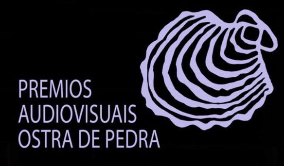
The old logo had become outdated so we made a significant decision to move as far away as possible from the previous design, because of its poor visual base and its instability.
We replaced both the isotype and the logotype with a more modern one to give it a more contemporary character without losing the main meaning that characterizes these awards. As for the isotype, we only found half an oyster, as if the words were inside (“ostras” means oyster). We find a very stylized typography, dry stick and angular to get closer to the present, and the new digital media that are the fundamental basis of the awards.


A liquid brand.
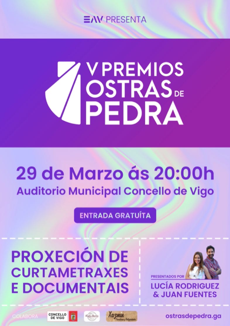
The most important point we had to address was the change of logo per edition. Each year, the logo adds the corresponding edition number and a themed graphic image is made.
We know that sometimes it is not possible to make an image from year to year so we designed a reference model for when it was not.


The decisive website.
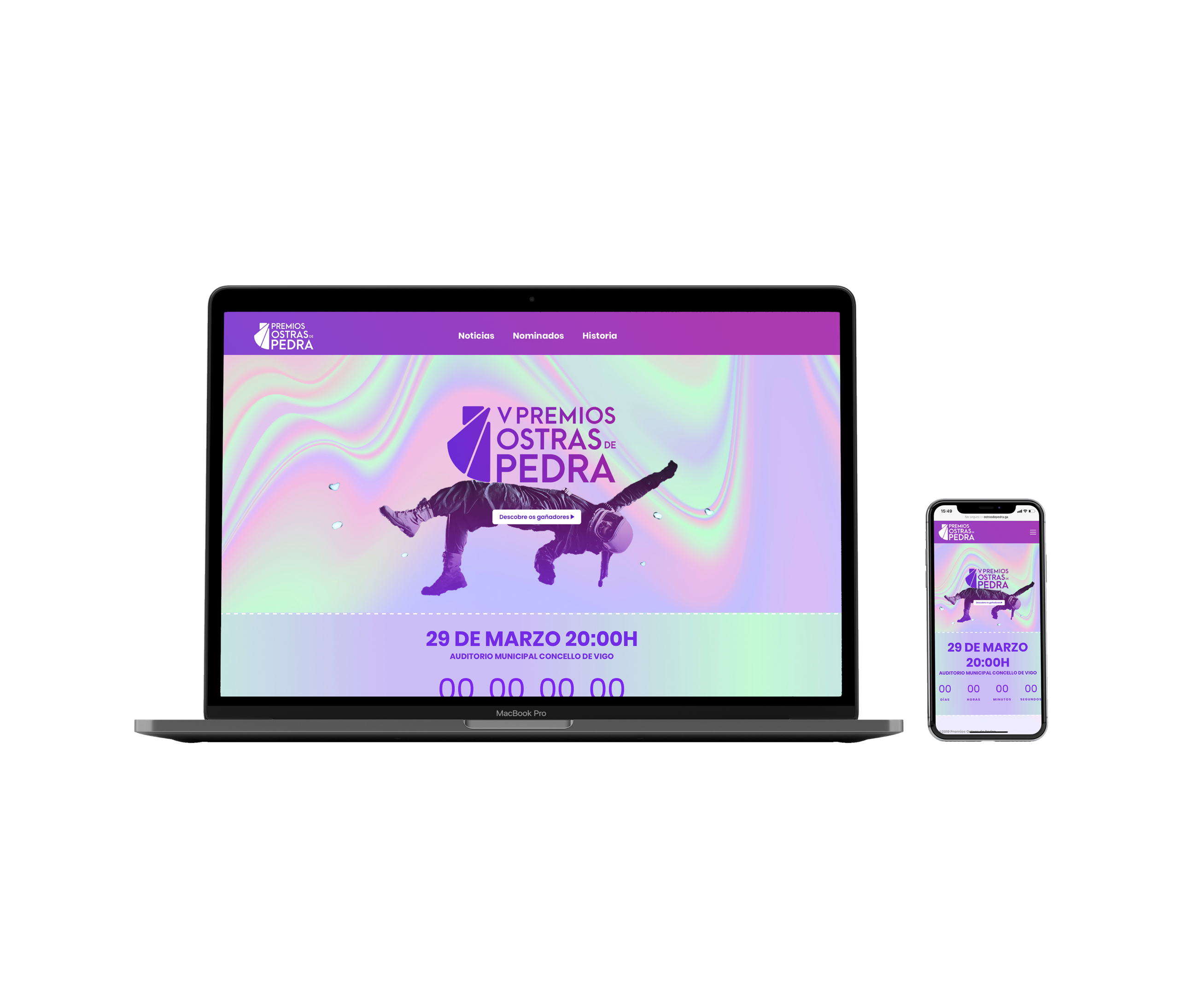
The idea arose to improve the way of voting. At the awards gala, the pieces are viewed and then voted in several categories for the favorite. Until now, voting was done on paper. Until now. We designed a website according to the new image and implemented an online voting system so that attendees could vote from their seats and thus lighten the process.