F10 INFORMÁTICA
BRANDING
UI/UX
A powerful tool to do wonderful things.
F10 is the home of SED, a food, beverage and meat distribution software that facilitates the management of companies of all types and in various fields.

A necessary change.
The previous logo was quite outdated and needed a change adapted to current times. We created a dynamic and expressive image keeping the characteristic blue color of the old brand in an electric version.
Control unleashed.
In addition to the logo, we also redesigned the brand image of SED, its main management product. And we helped implement the identity change in the software by designing the structure of the new interface.


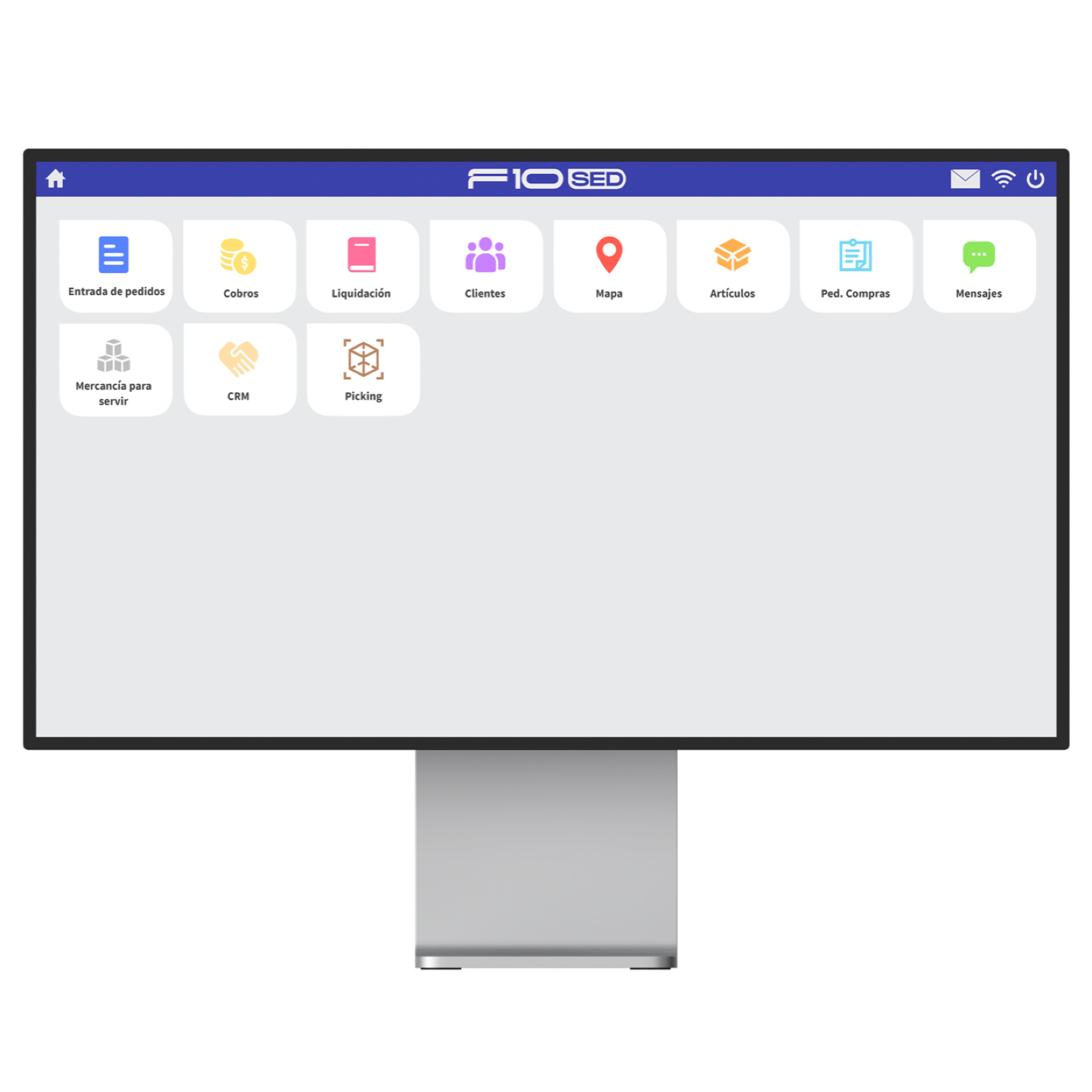
Iconography in harmony.
Making an iconography is simple. Making an iconography that was connected to the F10 logo was no easy task. After a lot of trial and error, we came up with icons that are fully integrated into the brand that anchor it and show the attention to detail that characterizes F10.